Dashboard
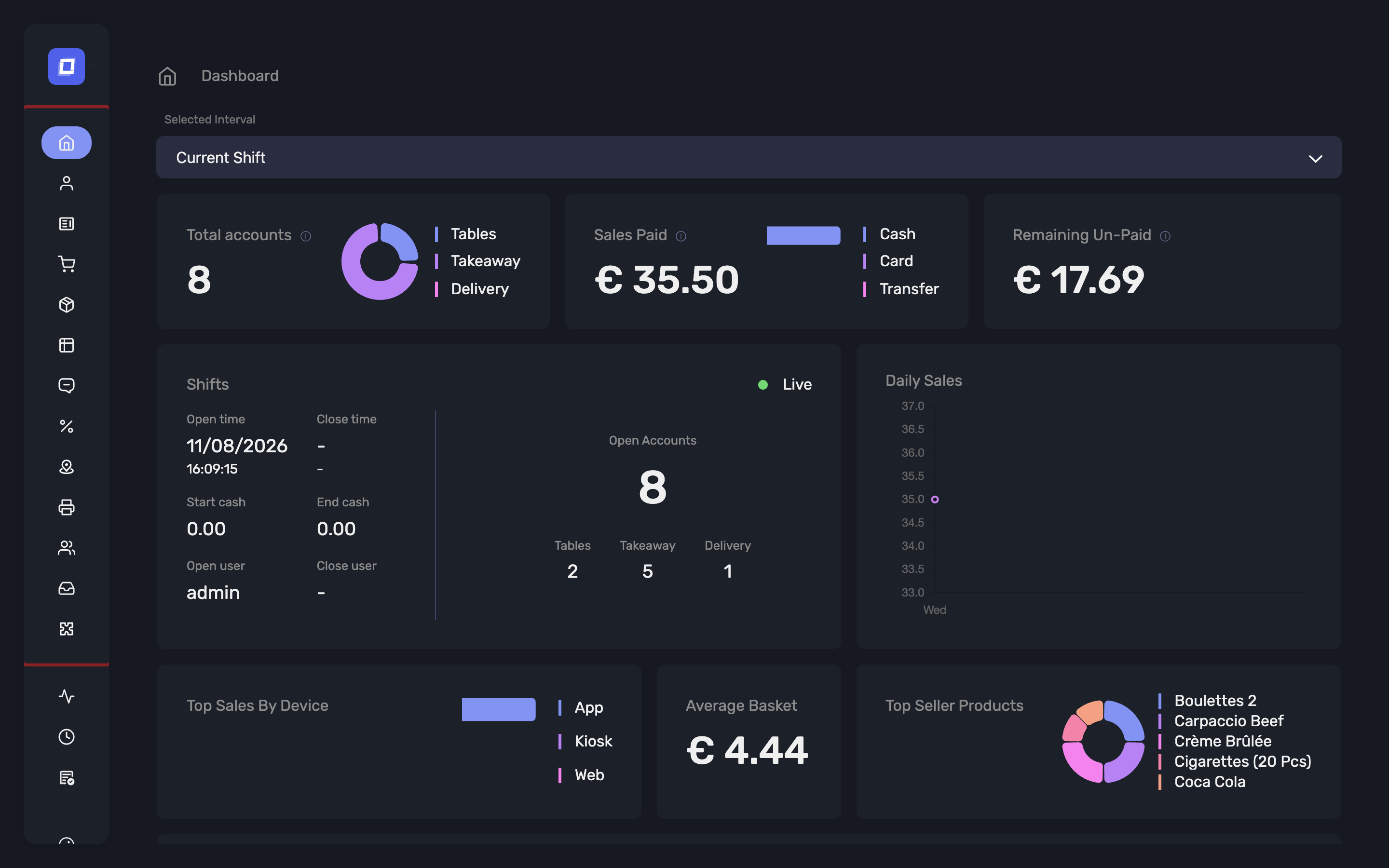
The Dashboard is the home screen of the Admin Panel and provides a general overview of key performance indicators (KPIs) for the establishment. This view is designed to offer real-time insights based on a selected reporting interval.
Note
By default, the dashboard displays data for the current shift. If no shift is currently active, no data will be shown. Users can select different intervals to view performance metrics across various timeframes.
Each section of the dashboard is represented as a card containing specific data points. These cards update dynamically based on the selected interval.
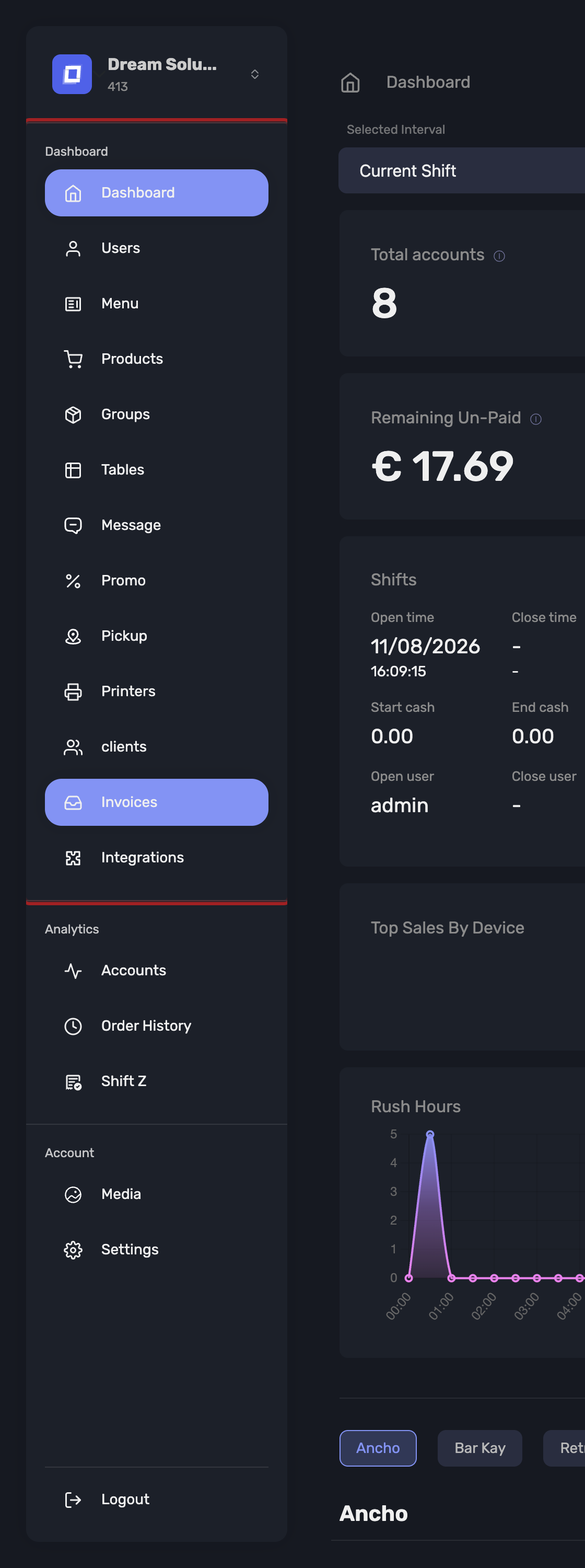
Open it from Dashboard in the sidebar.
Choosing the Reporting Interval
The interval selector at the top of the page offers:
- Current shift and Last shift
- Today and Yesterday
- This week and Last week
- This month and Last month
- Last 7 days, Last 30 days and Last 90 days
- Custom
Choosing Custom reveals a date range picker where you set your own start and end date and time. The dashboard reloads once both ends of the range are set.
Tip
The rolling options (Last 7 / 30 / 90 days) are the quickest way to compare like with like week over week, since they do not reset at the start of a calendar month.
Access to the Dashboard
What you see on this page depends on your abilities, configured per user in the Admin Panel:
- Dashboard – gives access to the general dashboard cards described below.
- Groups Dashboard – gives access to the Sales by product group section.
Administrators see both sections without any ability being set. A user granted only one of the two sees only that section, and a user with neither is told they do not have access.
Using the Dashboard
The dashboard answers "how is trading going right now, and how does that compare". It is a live operational view, not an accounting record.
| Question | Where to look |
|---|---|
| How is today going? | Current shift or Today, then Sales Paid and Total Accounts |
| Is anything still unpaid before I close? | Remaining & Unpaid, then Open Accounts |
| When are we busiest? | Daily Sales and Rush Hours |
| What sells, and where? | Top Sellers and Top Seller by Device |
| Are we spending more per customer? | Average Basket, over Last 30 days vs Last 90 days |
| How did each counter perform? | Sales by product group |
Warning
For accounting figures — takings per shift, VAT per rate, exports for your bookkeeper — use Accounting instead. The dashboard rounds and summarises for reading at a glance; the shift statistics are the figures to work from.
Tip
The dashboard defaults to the current shift, so an empty dashboard usually means no shift is open rather than no sales. Switch the interval to Today to see the day regardless.
Dashboard Cards and Their Descriptions
Total Accounts
Displays a summary of all accounts created during the selected period.
Includes:
- Number of open accounts
- Number of closed accounts
This allows managers to track how many accounts (tables, takeaways, deliveries) were handled during a shift.
Sales Paid
Shows the total value of paid transactions categorized by payment method:
- Cash
- Card
- Offered
This helps assess which payment methods were most used during the shift or selected interval.
Remaining & Unpaid
Displays transactions or items that are still unpaid.
This card highlights pending payments and helps ensure that all open accounts are processed before closing the shift.
Shift Overview
Provides information about the currently selected shift:
- Start time of the shift
- End time, if the shift has been closed
If the shift is still running, the end time and closing details will not be shown.
Open Accounts
Shows the number and types of currently open accounts, which represent active cost centers.
Details include:
- Total open accounts
- Breakdown by:
- Tables
- Takeaway
- Delivery
Daily Sales
Displays an hour-by-hour breakdown of sales activity throughout the selected day.
Useful for identifying peak transaction periods and staff performance.
Average Basket
Shows the average sales amount per account for the selected interval.
This metric gives insight into customer purchasing behavior and overall revenue per customer.
Top Sellers
Displays the most sold products during the selected interval.
This helps identify high-performing items and can be used to inform promotions or inventory management.
Rush Hours
Presents a visual overview of the busiest hours of the day, based on transaction volume.
Useful for understanding peak traffic periods and optimizing staffing.
Top Seller by Device
Breaks the best-selling products down per device, so you can see what each register, kiosk or counter is actually selling.
Useful in venues with several points of sale, where a product can be a top seller on one device and barely move on another.
Sales by Product Group
Below the general cards, the Sales by product group section reports performance per product group. It is intended for establishments that run several counters, corners or shops, each represented by its own product group.
Each group is reported with:
- Revenue – total revenue including VAT for the group
- Quantity sold
- Accounts – the number of distinct accounts (tickets) involving the group
- Average basket and Average price
- Sub-groups – the same figures broken down one level further
- Top products and Rush hours for the group
- Total sales, VAT by rate, Sales by channel and Discounts
Open Details on a group to see its full breakdown.
Note
The section is hidden when there is no data for the selected interval, and the page shows No data to display for this period.
Note
A user restricted to specific Product groups sees only those groups reported here — a counter manager gets their own counter's figures, not the establishment's. Administrators see every top-level group. See Users → Product Groups.
Tip
Combine this with the Custom interval to compare two counters over the exact same window — for example a weekend service against the previous one.